


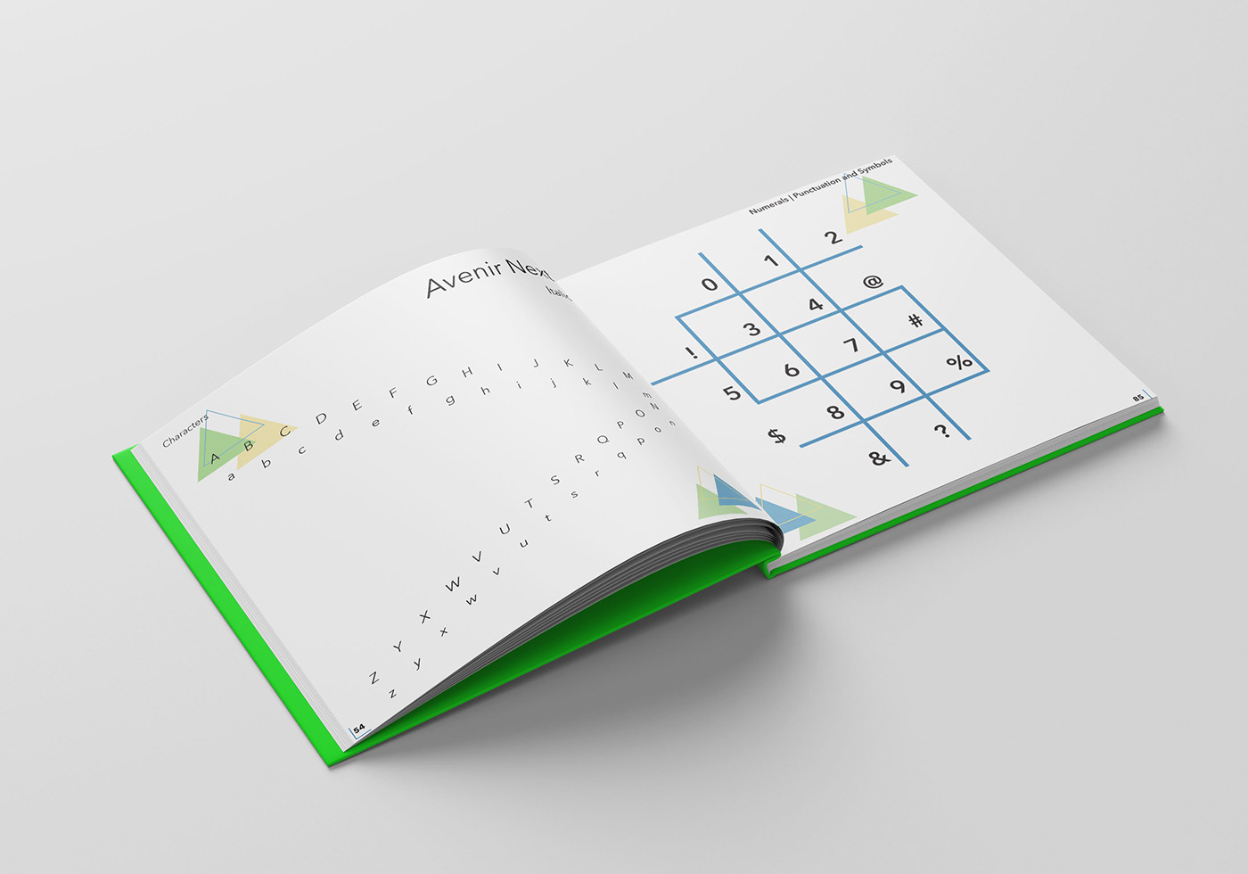
The theme for this book is based on Jeff Koons' balloon animal work and geometric designs. Avenir Next was the typeface chosen for this book because Adrian Frutiger created it based on the original 1988 version called Avenir. Although Avenir Next came out in 2004, the design for this book has design elements from the 80s when Avenir came out.


Type Book | Marvelous Mr. Koons
Design Challenge:
The theme of the book is inspired by Jeff Koons’ balloon animal artwork and geometric designs. The choice of the Avenir Next typeface, a contemporary rendition of the original Avenir typeface created by Adrian Frutiger in 1988, aligns with the design elements from the 1980s. Despite the release of Avenir Next in 2004, the book’s design elements evoke a sense of nostalgia, reflecting the aesthetic of the era in which the original Avenir typeface was introduced.
Design Solution:
The use of Avenir Next in the book serves to highlight and showcase Adrian Frutiger’s typographic work, providing readers with an enhanced viewing experience of the typeface’s refined and modernized version. By incorporating the geometric and playful themes inspired by Jeff Koons’ balloon animal artwork, the book’s design appears to create a visual harmony that complements the clean and contemporary style of Avenir Next.


